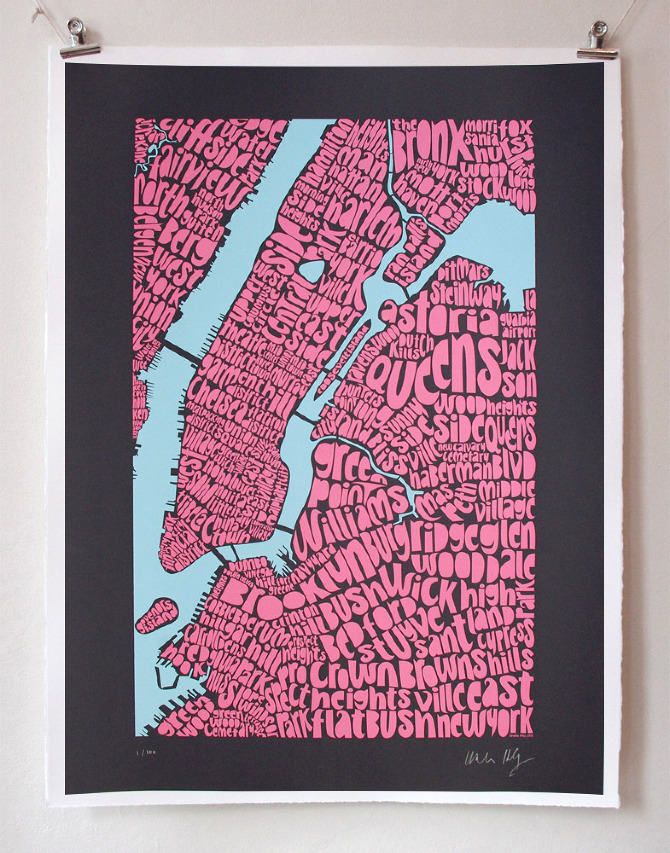
Ursula Hitz loves her typography. So much so, that she creates regional maps using them. But you need to look closely to get the true talent involved in this masterpiece. Every borough is lovingly outlined through her placement of the words, so that New York becomes a hodge podge of word sections that differentiate one neighborhood from another. Pretty clever, right?
She’s given this treatment to a range of cities that are close to her heart, including London, Paris, and Zurich. And she’s also created more memorable word art that you can view on her blog, Seagull’s Eye. For a fellow word lover, this is a great new way of making a connection to our favorite places while letting us see them in a new light.
– another find starting with DesignTaxi -> Ursula Hitz


Pingback: Design Garden