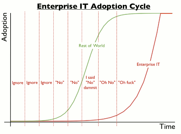
Much of the business world has a reputation for being cheap regarding the wrong things – like critical infrastructure. So to see a chart which hilariously (but accurately) describes the corporate buying cycle of IT products is a treat.
Simon Wardley decided to depict a tweet by @jdrumgoole in the chart above. Anyone who works (or has worked) in or with IT can truly relate to the timeline. It actually can also translate to a lot of other buying habits that are associated with the production of a product. I should know because I used to be a buyer.
Advertising = oh, whatever you need is yours! After all, it’s the public face of our company!!
(mostly) Everything else = see chart above
Workers of the world, you have our sympathy. And thanks to Boing Boing for the awesome share.


