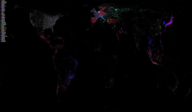
Eric Fischer’s work always deserves coverage because he has such a unique way of visualizing our world. He has once again looked at Twitter data with the use of a portion of Chrome’s open-source language detector which was extracted by Mike McCandless. This time he’s created a global Twitter language map which gives us a glimpse of how concentrated spoken languages are in different geographic regions. This image was created from data collected from May 14th to October 20th, 2011, using color markers so that they showed “maximum distinguishability” of the languages used near one another. The color marker for English was toned down as it is still common throughout the world.
But clearly, the interesting aspects of this map are the close-up views of different regions to see the pockets of languages that stand out against a country’s common language. Find out more takes on this map by going to DesignTaxi -> HYPENOTICE -> Big Think. It’s definitely becoming a popular share, with good reason. Once again, Eric brings us a little closer to understanding this amazing world we live, talk, and share in. I love Eric’s work!


