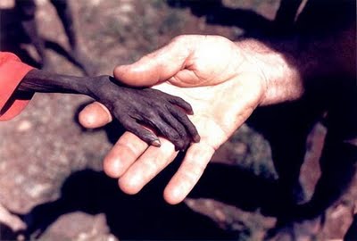
Michael Wells (1980) UK
Hands – A starving boy and a missionary, Karamoja, Uganda.
Photojournalism has brought us some of the most amazing and horrifying images that this world has to offer. It speaks through the lens of each photographer who captures a moment in time that affected a usually necessary impartiality. In a similar manner, authors have used their words to capture a scene, either fact or fiction, and transmit it to the reader. Both of these creators have an enormous burden in using care when putting forth their creations, so as to bring out a simple telling of that moment to the viewer without prejudice (or as little as possible).
The problem comes when those creations leave their hands and propagate through the world. When the creation’s context is severed, then it’s up to the viewer to come up with a reasonable discussion to accompany the creation. Sometimes the second level of creators are not as careful as the first, and a different message is attached to the creation. If this message doesn’t destroy the initial intent, then perhaps it is appropriate that the two coexist with one another. But if an entirely different message is propagated, perhaps with innocent intentions, then we must examine the process to see how we all play a part in keeping the original creator’s intent alive.
What brings me to this post is this blog post: 22 Heartbreaking Photojournalism pictures – Bleeding For Peace!
Let me say that the images are an emotional collection of the cruelty that humanity visits upon itself and the world that surrounds them. Each one had an important message to say. But wouldn’t the message have been better if they were displayed in a more appropriate manner so that we had to contemplate each one of them individually? And wouldn’t it have been better if the author didn’t then choose to add a personal message about the images collectively that affects the reader before the images are even viewed? I would have left the message until the end, so that the images had a more personal impact (not that they didn’t anyways). And last but not least, where are the names of each photographer so that we know who created them?
In a case such as this, more seems to desensitize us because we are only able to handle so much before our survival mechanism kicks in. The message becomes lost in the numbers. If I wanted to convey the sheer atrocities in numbers, then I would have presented them smaller and closer together so that en mass they overwhelm, but I can still enlarge each one individually so that I can inspect the feelings they convey and extract in a manner that they deserve. Sorry for that bit of personal preference, but I want to give each image its proper due. The creator had an intent when taking a picture or writing a story, and I would not want to be the one to lessen the impact of their original purpose. Impartiality has got to be difficult when doing such important work for humanity.
So in closing, when presenting photo-journalistic creations, we should treat them with the same reverence that we treat our favorite books. Individually and carefully, so that each one stands alone to be properly appreciated.
Here’s an interesting blog section that I encountered on journalism: North Coast Cafe, South.
And here is the World Press photos of the year winners, including the image I’ve selected for this post by Michael Wells. It’s interesting to note that when I was researching this photograph, I came across a website that stated that Michael hadn’t even submitted this photograph into the contest and didn’t want recognition when people were starving. The publication that he took this picture for completed his submission even though they waited on publishing it themselves.
Just saying…


