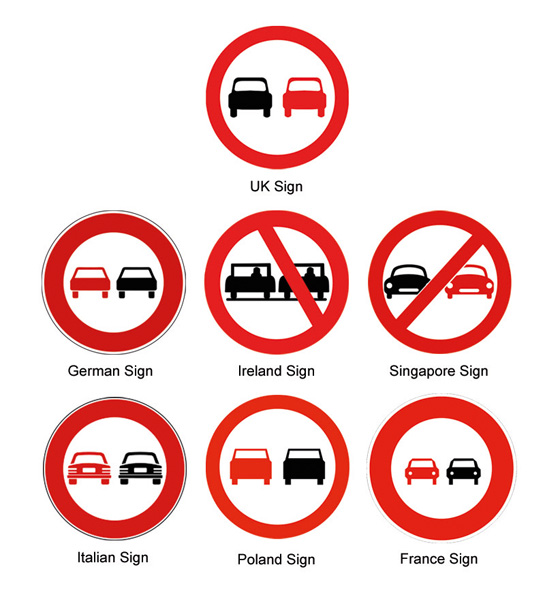
We see road signs all around us, telling us to do things in a sometimes imperious manner. For the age of political correctness, it seems that the signs didn’t get that memo. Of course, this might partially have to do with several factors:
- Time to communicate
- Too large a message to distill quickly
- Limited audience space
- Old-fashioned mentalities
- Lack of resources to make effective products
The people who are many times called to design these signs are not the types of people who concentrate on the concept of design. But why not ask designers to accomplish this task? After all, they do this type of design work on a daily basis for a multitude of clients and messages. Well, Blueprint Magazine in the UK decided that it was high time to do just this. So, they put out a call to architects, designers, and illustrators to come up with a new bumper crop of signs that will talk in the language of the 21st century. No, the language hasn’t changed per say, but the audience has. How do you think they did?
– found through a DesignTaxi post -> Blueprint Magazine


